A basic overview of the fright attraction design process!
By Leonard Pickel, Hauntreprneurs.com Attraction Design and Consulting
My background is architecture, and I design attractions using the architectural principle that “form ever follows function.” Meaning that the purpose of a building (or any object) should dictate its shape. In haunted attraction design, scaring people is the function. Therefore, the design should help to increase the effectiveness of the scares. The form (shape and decoration) of the room and the rest of the attraction should flow from the scares. Rather than deciding on the room first and what the actor will do to startle the patrons last, good attraction design starts with what will scare the guests and uses the attraction design to maximize the effectiveness of the scares.
The following describes how to design your fright attraction to serve its primary purpose—to scare the living crap out of your guests. You can’t scare everyone, but you can profitably entertain them.
Key takeaways:
- Design Your Haunt for the Hardest Person to Scare
- Keep the Guest Guessing
- Structure Your Design around Story
- Design Your Haunt for Maximum Capacity and High Throughput
- Scare the Whole Group Forward
- Darkness and Claustrophobia Are Your Friends
- Shorten the Sight Lines and Figure Out Where to Hide the Monsters
- Design the Room Around the Scare
- Mix Up the Scares
- Pace Your Scares and Control the Guests’ Attention
- Give Your Guests a Break
- Maximize the Travel Distance
Watch this Session
The video recording of this session is available free on HAuNT Connect.
Design Your Haunt for the Hardest Person to Scare
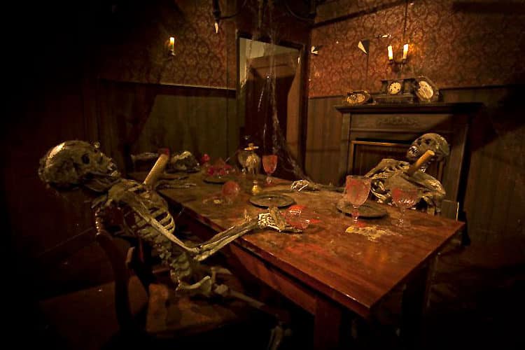
People emerge from a haunted attraction with usually one of two complaints—it wasn’t long enough (because they wanted to experience the fear longer than they could), or it wasn’t scary enough. We may not be able to do much about the first, given various physical constraints, but it’s our job to address the second. To do this, we first need to know, “Who’s the hardest person to scare?”
I believe the most difficult person to scare in a haunted attraction is a 21-year-old white male. He’s attending with a date, or his buddies, and cannot afford to be seen screaming like a 14-year-old girl. If I can scare him, then the rest of the crowd is a piece of cake. That 21-year-old guy will not be afraid of a bathtub full of mannequin parts splattered with red paint. To scare him, you’ve got to do the unexpected. You’ve got to do something he’s not expecting—a sudden movement, a sudden appearance of a prop, an actor popping out of nowhere, a sudden sound, or the presence of imminent danger. That’s what scares people.
Keep the Guest Guessing
Engaging people’s imagination is a huge asset in haunted attraction design. People aren’t afraid of the dark; they’re afraid of what might be in the dark. Making use of darkness and the unknown is a brilliant opportunity to build up the anticipation of what may be about to happen. Some of the most effective scares use misdirection. Show your guests something they think will scare them, and then scare them from a different direction.
Use Your Story to Form the Structure of Your Design
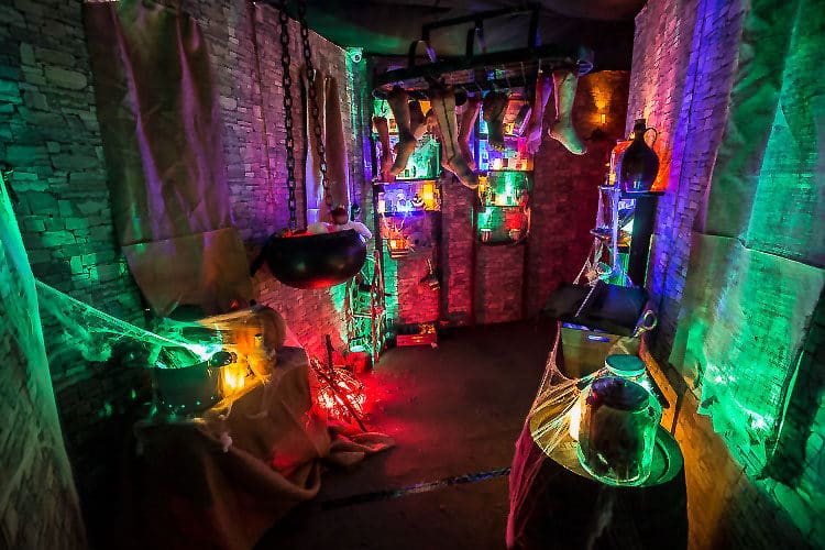
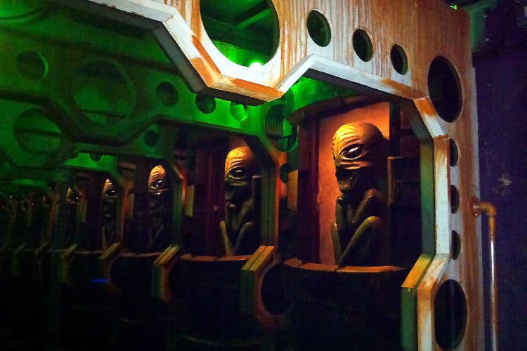
As haunters, we’re in the entertainment business. A haunted attraction is like a horror movie or play in which guests walk from scene to scene, and, like any movie, we’re telling our patrons a story. Your attraction needs a storyline to entertain. A story adds entertainment value to the experience and gives people something to read on your website. However, the primary function of the story is to serve as a map for the attraction designer. The story is how the designer gets from the beginning to the end of the experience logically, without getting lost or going off track. A well-developed story inhibits the shotgun room-design approach seen in many attractions in which there’s an alien creature next to a clown next to the Frankenstein monster.
A storyline establishes the nature of the evil that patrons will face. It locks in the time period, the location where the story takes place and provides the attraction designer direction. It also prevents impulsively buying that cool Frankenstein prop, awesome clown costume, and amazing alien prop, and cramming them in the same haunt when they don’t fit together.
Design Your Haunt for Maximum Capacity and High Throughput
If you design a haunted house to accommodate 200 or 300 people an hour, and you push that to 400 or 500 people to handle the crowds, the show quality will suffer. It won’t be as effective as originally intended. However, if you design your haunted house to handle a constant line and still scare every patron, then, when you need it for few hours on a busy Saturday night late in the season, the capacity is there. In architecture, we always design to the worst-case scenario. So, design your attraction for maximum capacity while keeping high experience quality. Give them a show, but give it to them on the run!
Scare the Whole Group Forward
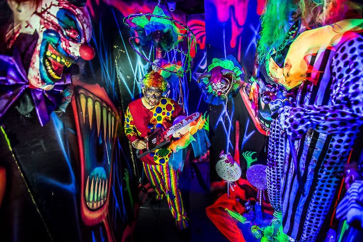
The ability to provide a quality experience at high capacity requires the haunt designer to sacrifice the “skit”-based room design. This is the room concept where people enter a room, are stopped by an actor, the actor performs a skit, and some scare gets them moving again. It’s almost impossible to stop frightened people in a haunted house and, if you get them stopped, it’s almost impossible to get them moving again.
In the same way, actors speaking dialogue in your haunt will wreck your capacity. If you have a storyline piece or history of the attraction that you want your guests to know about, relay this while they’re moving. Have an actor talk to guests in the queue line or in a room that patrons flow through. Keep guests moving throughout the attraction.
To maximize your capacity, the scare itself should force guests forward. Scare from the back, the top, the bottom, and from both sides, but never, ever from the front. Scaring the first person in line backward will lower your capacity. To maximize throughput, scare the guests forward, almost chasing them through the attraction. This approach also allows the designer to scare the whole group. Some scares should be designated to target the middle and end of the group. Make sure the scares are timed and located so that everybody in the group gets the same number of startles.
I learned that, for a right-handed person, a scare is more effective if it comes from the left side, so I place my weaker scares on the left until near the end of the attraction, and then I have my best scares on the left.
Darkness and Claustrophobia Are Your Friends
Architects use the shape of a room to make people feel comfortable in the space. As a haunt designer, I break all of those rules to make people feel uncomfortable. A small, dark space is unnerving to most people, and you can create this architecturally with a very narrow, very high-ceilinged hallway. A very wide hallway with a low ceiling can also create a feeling of claustrophobia. Darkness is the haunt designer’s friend. Lower light levels mean the scene requires less detail. Light what you want people to see, and let the rest fade to black!
I realize that plywood comes in 4-foot by 8-foot sheets and that most residential houses are built with 8-foot-tall walls, but they also have a ceiling at 8 feet. A haunted attraction with 8-foot walls and no ceiling has a clipped-off feeling, and, many times, the patron can see lighting and effects over the top of the walls. This decreases the suspension of disbelief we need guests to have before they can be frightened. These days, I specify a 10-foot-tall wall panel (12-foot-tall walls are even better). If you raise that 8-foot wall up just two feet, there’s less chance of the patrons seeing into other rooms of the haunt. The walls fade to black at the top. Light fixtures are out of reach and disappear into the void, and taller walls give the hall or room a more realistic feeling.
Shorten the Sight Lines and Figure Out Where to Hide the Monsters
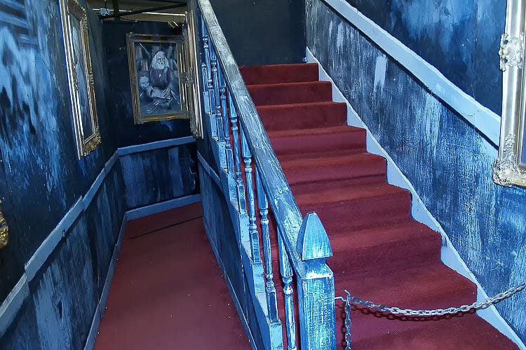
It’s almost impossible for an actor standing in the open to scare people. Remember, we’re trying to do the unexpected. Designing a place for your actor to hide within the architecture of the room is essential for fright effectiveness and high capacity. The actor needs to be able to pop out and startle the group, hide again quickly, and be ready for the next group.
Long, straight hallways are killers for your capacity. The shorter your sightline, the closer your groups can be to each other without being able to see what’s happening to the group ahead of them. Interrupting the sight line with twisting turning pathways and stuff hanging in the patrons’ faces will hide hallway scares. Placing tall props or furniture in the rooms both creates the best pathway for the scare and can also hide the scare from the next group. Use furniture and set pieces to create a winding pathway, and make sure you put something between the actors and the guests to protect both from accidental interaction.
When guests enter the room, you don’t want them to know exactly where the exit is. Block the view of the room exit with props or set pieces, so patrons don’t just bolt through the room. Make them visually search for where to go, giving your actors a better chance to create a great scare.
Shortening the sightline and hiding the actors is challenging in a haunted trail. Make sure the pathway is constantly snaking through the woods around trees and bushes with no straight views. Planting quick-growing plants, adding camo-netting, and a shack or outhouse can help cut down the sightlines and provide hidden scare locations for actors.
Design the Room Around the Scare
The first decision to make for each room is what the actor will do to scare people in that room. Then, place the scare so that the pathway has the best approach to enhance the effectiveness of the scare. Do you want guests walking directly at the scare, or do you want them to walk past it? Is the scare more effective in a hallway, or just around the corner? Use the props and set pieces in the room to steer guests toward the scare in the most effective direction. Once the pathway and scare are maximized for effectiveness, only then do you draw the walls around the outside of the space and determine the size and shape of each room. Once you have the shape and size of all the rooms, you arrange these into your floor plan in a logical order with your best scare last and the next-to-best scare first.
I also try to locate the exit of the attraction right next to the queue line, so the people waiting to go in can watch the people coming out. I place my best scare last, so people are hurrying out of the attraction. This design heightens the excitement of people about to enter the attraction and increases the anticipation about what they’re about to experience.
Mix Up the Scares
Few startle scares are available for fright attractions. Pop-out scares, like crash doors or shutters; sliding panels or drop panels; slap-down, curtain burst, and camouflage scares like the dot room or camo-monster. This is the color palette we use to paint the experience, so make sure you have each of these in your attraction. Rotate them, disguise them differently, and place the scares, so they come from different directions targeting different parts of the group.
Pace Your Scares and Control the Guests’ Attention
I always design in a short piece of dark hallway between each room. This cuts down the sightline from room to room and lets patrons reset before the next scare. These hallways are longer at the beginning of the attraction and shorter toward the end to speed up scares and throughput.
Some scares are more effective when the guests are looking right at the action, whereas others are best when the patron is looking away, as in a misdirection scare— Control where people are looking in your attraction using light and sound. A spotlight on a prop in an otherwise darkened room will direct the guests’ attention to the prop or create noise in a dark corner, and people will look in that direction. These tactics can direct attention toward or away from the scare for the best effect.
Give Your Guests a Break
Don’t be afraid to add humor to your haunt. Within an attraction, scare after scare after scare creates a diminishing return on the effect that startles have on the patrons. Try to include sight gags or the actor saying something funny to break up the monotony. If you give patrons a chance to laugh at their situation, the next great scare will be even more effective. Even Alfred Hitchcock used a funny scene in the middle of his scary films to give viewers a chance to catch their breath before building up to the horrific climax.
Maximize the Travel Distance
Without taking an average from a large sampling of attendees, you can’t measure a haunt by how long it takes to go through. Some people take off running at the first scare, while others creep along too frightened even to move. So, the only way to measure one haunted house against another is the length of the linear pathway that patrons take through it. Maximizing this travel distance is how you make your fright experience longer.
Think of your attraction design like a “daisy,” with the yellow center being where air, electrical, actors, and special effects are located and the white petals representing the pathway the attendees travel from scare to scare. This allows you to maximize the patron travel distance while minimizing the electrical and air line runs to the rooms. This daisy design is even more economical when used for a haunted hayride or haunted trail.
If you design your scares to be effective on a 21-year-old white male, it will terrify everyone else! Use the patrons’ own imaginations and fears when designing the room concepts. Use darkness and claustrophobia to build anticipation, and use misdirection to keep patrons guessing where the scare will come from. We create the best attraction designs around a storyline that establishes location, time frame, and the evil that patrons are about to encounter. Use this storyline as a map to keep the design from confusing guests with illogical room connections and themes that don’t fit together.
First, decide what the actor will do to scare patrons in each room, then design the room around the scare using furniture, props, and other scenic pieces to create the pathway for guests to walk toward or past the scare for best effect. Use twisting pathways to cut your sightlines and keep patrons from seeing the scares ahead of them, allowing groups to be closer together and increasing the capacity. Design for the worst situation—a constant line of people moving through the attraction. You won’t need that throughput all the time, but when you do, it will be there and will still give the guests a show on the run.
Scare everyone who goes through the attraction, including people in the back and middle of the groups, and vary the types of scares, but always scare them forward, never backward. Place the scares and create room designs to accelerate the patrons through the attraction, but give your guests a chance to relax a bit with some funny sight gags before you build for the final big scare.
Once you’ve come up with a pathway plan that works, start over from scratch. Come up with several different designs while working toward the most logical room design order, best acceleration of scare factor, and best use of decreasing pathway between rooms while maximizing the travel distance. Regard nothing as sacred until the whole plan gels into the final version. Remember that no plan is perfect, and each element is a tradeoff. The best design is the one that solves for each factor equally well.
About HAuNT Connect
HAuNT Connect is a FREE online community to connect the haunted attractions industry at large. Featuring live education and webinars by industry experts, vendor showrooms with products, virtual meeting opportunities to discuss and source products for your attraction, peer-to-peer networking, idea sharing, and more. Register here.